Cities and Memory branding
Logo design and branding for international sound art project
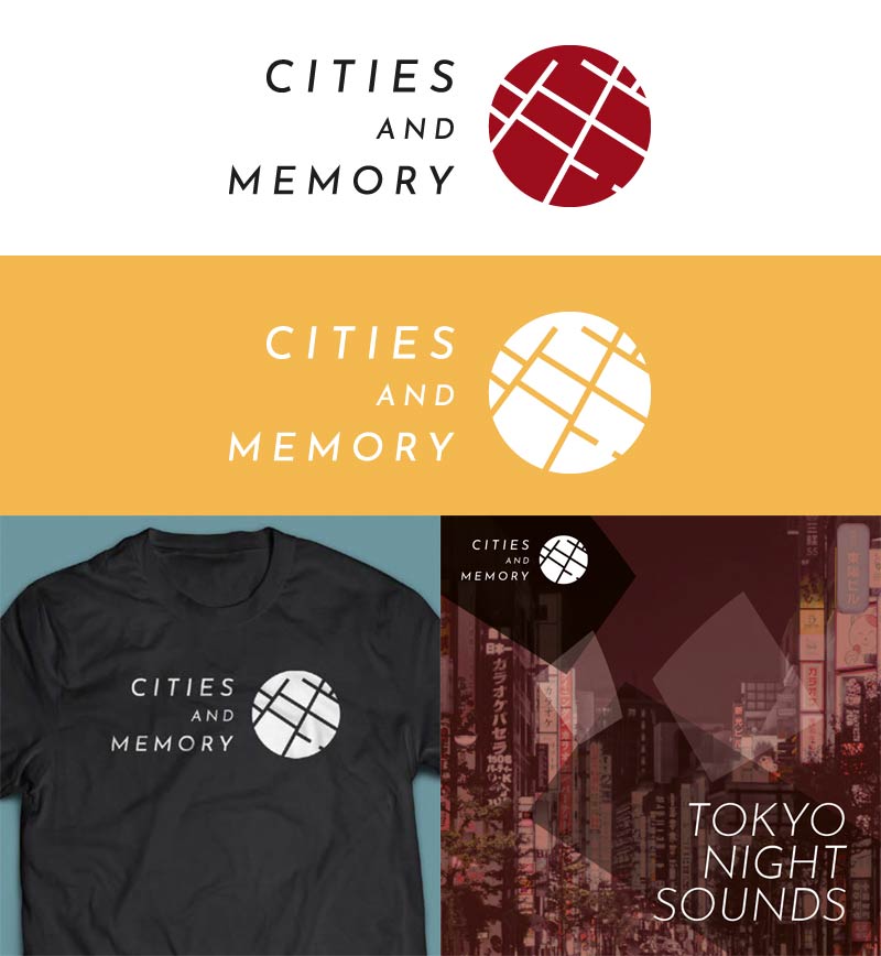
Cities and Memory is one of the world’s biggest sound projects, a global, collaborative sound art and field recording programme with the aim of remixing the world, one sound at a time. It covers more than 100 countries and territories with 5,000+ sounds and more than 1,000 contributing artists.
I've known the founder Stuart Fowkes for many years so was happy to be asked to create a logo and brand guidelines for the project. We worked closely and iterated through many ideas and styles, arriving at a logo based on a section of street map layout from Venice, at the precise point at the project's first field recording from the city was made. The logo was designed and delivered in a way that was suitable for the largely online nature of Cities and Memory, including its representation across a large variety of social media and other platforms.
Simple brand guidelines were developed to accompany the logo and direct its usage within an overall style. A palette of colours was chosen to complement the logo colours, and a typeface chosen to represent the dynamic and creative aims of the project. A selection of fragments broken out of the logo were provided as 'base materials' for materials such as release artwork, in order to subtly build a brand with a strong core.
Client: Cities and Memory